PACKAGING
Lakefront Brewery
Brand IdentityPackaging
The Goal
One of the things that separates craft breweries from mega-brewers is the variety of beers they concoct. It's what makes them special, as well as challenging. Each new brew needs a distinct name and packaging that stands apart from the sea of other micro-brews. Lakefront tasked us with adding a sense of playfulness to the names and labels without completely abandoning their existing brand identity.
-
An Appealing Organic
For Organika, an organic Belgian White beer, we needed to make the packaging appealing to people who seek organic products, while also engaging drinkers who are simply interested in its flavor profile.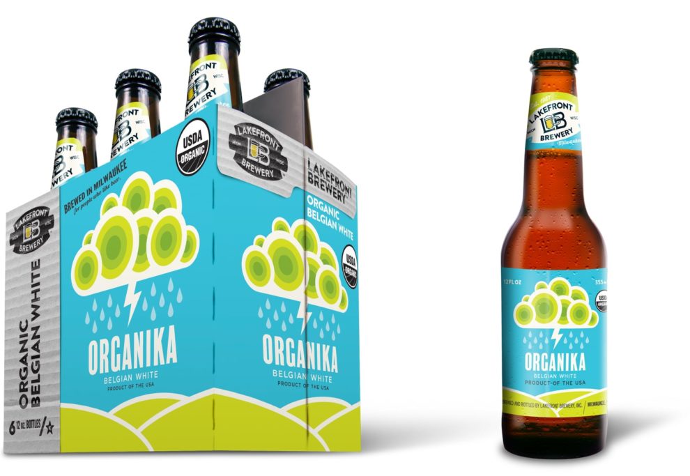
Double IPAs, Six Times The Fun
For their numerous Double IPA rollouts, we took naming and packaging inspiration from their bold flavor profile as well as craft beer drinkers’ appetites for the new and unusual. Strange Neighbor? Check. Mangy Rabbit? Check. A beer named “Polka Incident,” with an interactive label styled after a popular party game? Check and check.
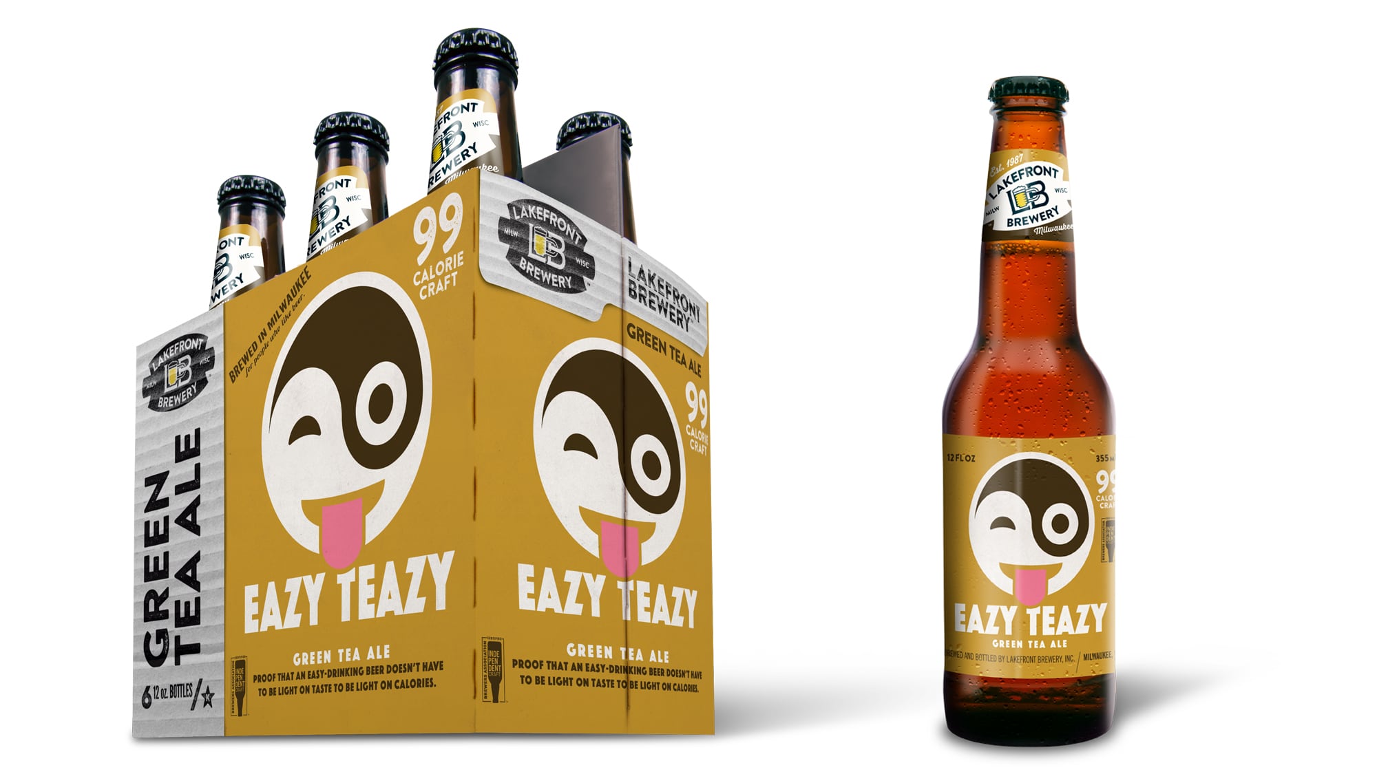
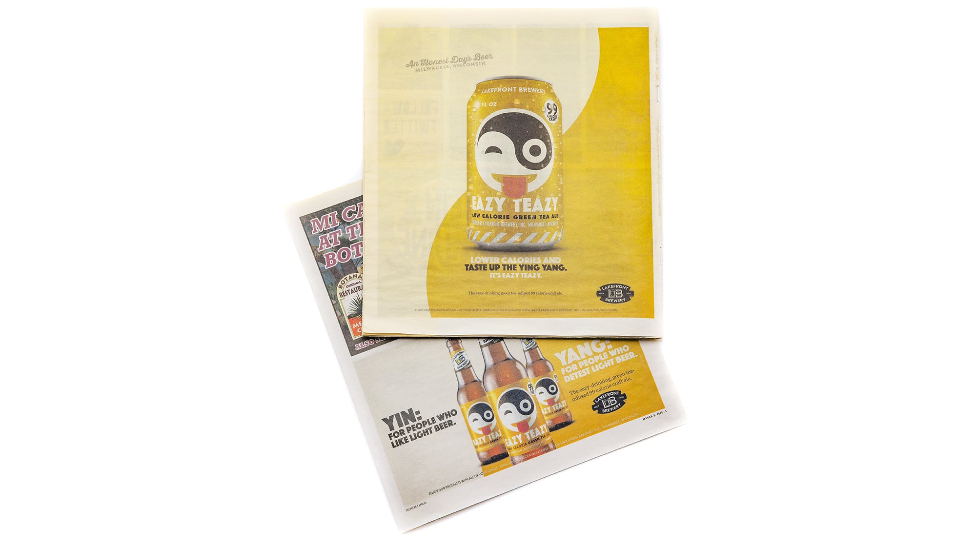
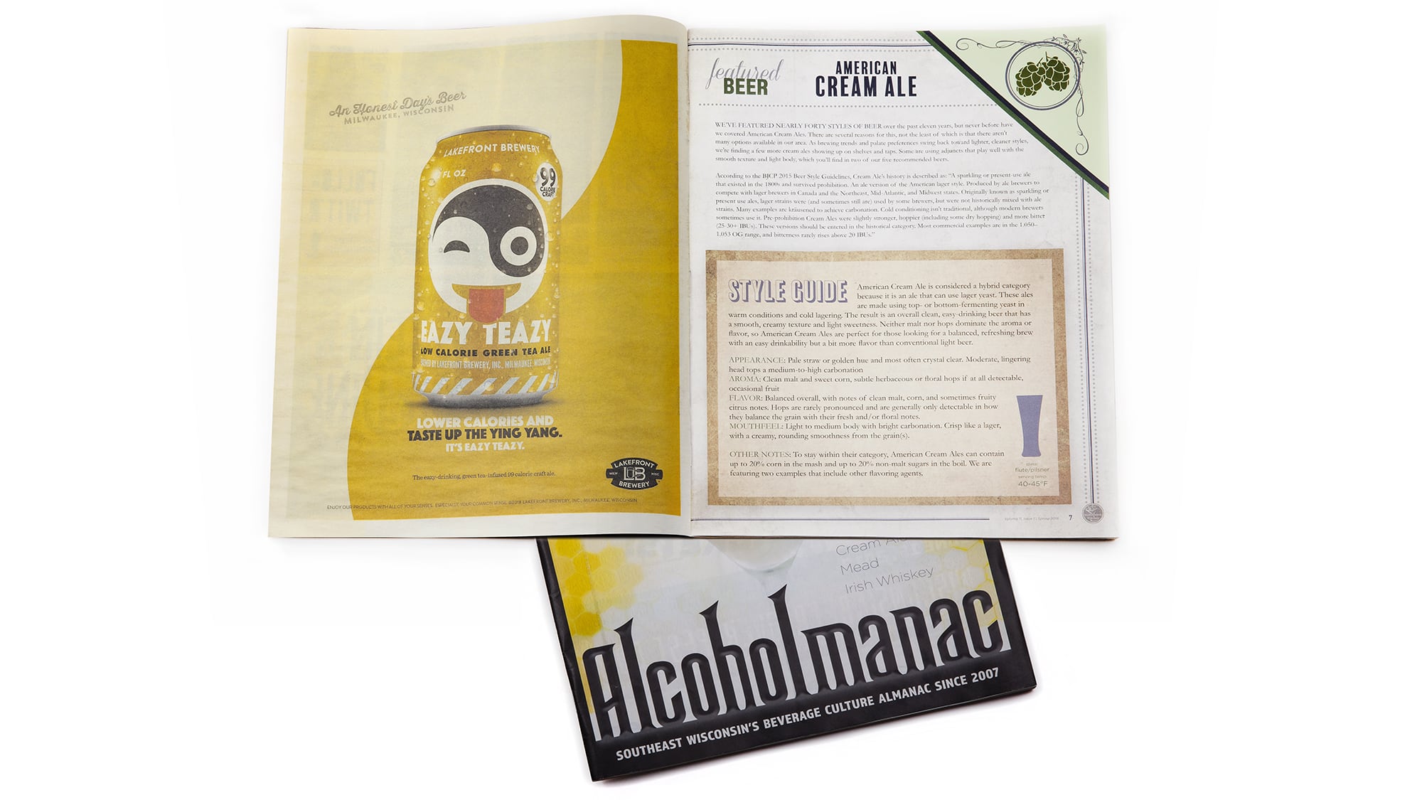
Infused With Personality
Naming Lakefront’s lighter, tea-infused ale was the easy part. Finding the right voice and packaging proved a little trickier – until we hit upon a yin-yang character that could represent its low-calorie yet full-taste dichotomy.